Choosing Your Brand Fonts
Welcome to the final blog post in our branding series. So far we have defined your ideal customer profile, created a mood board, created a logo and chosen your brand colour scheme. In this post we discuss choosing your brand fonts.
You might think that people don’t pay much attention to fonts, however, they have a more powerful subliminal effect on a customers’ perception of your overall brand than you might expect. Fonts help shape your overall brand personality by helping to establish the tone for your brand voice.
When choosing your brand fonts, ideally you want to select three different fonts:
1. Logo font:
Refer to our logo blog post on creating your logo. Keep the font that you chose for your logo specific to your logo. If you use the same fonts across other elements of your branding it will lessen the impact of your logo.
2. Secondary font:
Choose a font that can compliment your logo to be used for headings, buttons, navigation links, etc.
3. Body font:
A simple and readable font reserved for any body copy. The goal when choosing your body font is to find a font that is easy to read but compliments the vibe of your logo and secondary font. Don’t opt for decorative or fancy font here. Keep it simple and minimal.
Different Types of Fonts and What They Represent:
Now for the fun part, exploring different font types! Each type of font will have a different vibe. Think back to the list of brand adjectives you wrote down when you defined your ideal customer profile. Is your brand modern or classic? Feminine or Masculine? Simple or Intricate? You want to select font types that help portray the vibe of your brand.
Let’s explore the different types of fonts and what they represent:
Serif Fonts:
Serif fonts are the oldest, more classic font type. A serif is a small line attached to the end of a stroke in a letter or symbol.
Vibe: classy, classic, high-end
Sans-Serif Fonts:
Sans-Serif fonts are more modern and simple. Sans means “without” in Old French and Sans Serif refers to a letterform that is "without serifs". Sans serif fonts tend to have less line width variation than serif fonts. In print, they are often used for headings rather than for body text.
Vibe: simple, modern, minimal.
Slab SERIF fonts:
Slab fonts are probably the most ‘old-school’ font from the serif family. A slab serif typeface is a type of font characterised by thick, block-like serifs. Due to their bold nature, they should be used sparingly and carefully, and are most appropriately used in logos and headings.
Vibe: Old-school, nerdy, bold, masculine
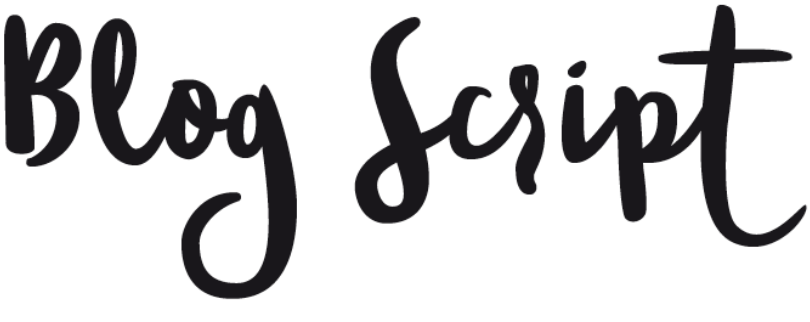
script fonts:
Script fonts have seen a rise in popularity in recent years with brands wanting to look more modern, playful and fun. Script typefaces are based on the varied and often fluid stroke created by handwriting. Due to their decorative nature, they are generally reserved for logos and headings.
Vibe: Fun, modern, playful, feminine
Pairing Fonts
Now that you know what each of the different fonts represents, the next step is choosing fonts that complement one another.
Fonts are most powerful when you choose a combination of contrasting fonts that support each other.
There are two simple ways to do this:
Use two fonts from two different categories: For example, a serif font for your logo and a sans-serif font for your headings.
Use two fonts from the same category but style them differently: For example, using a sans-serif font in bold capitals for your heading and a sans-serif font in light-weight for your body.
Canva have a great article with 20 unique font combinations to help give you a little inspiration when getting started.
That’s a wrap for our branding series! We hope you learnt a lot and have been able to use this information to create an amazing brand that WOWs your customers. If you have any questions, feel free to reach out to us here.


