
Choosing your brand colour scheme
Congratulations, you're almost to the end of your branding journey! So far you've defined your ideal customer, created a mood board and created a logo. In this blog post we step you through the process of choosing your brand colour scheme.
While your brand colours may seem like an insignificant detail, they can actually have a big impact on your brand identity. Colour can be a great way to portray emotion and create brand recognition. In fact, colour has been found to increase brand recognition by up to 80 percent.
(Source: University of Loyola, Maryland study).
To help you in choosing the perfect colour scheme for your brand, we've written down our process:
1. Select your starting colours
Take a look at the brand adjectives you wrote down when you defined your ideal customer profile. Write down what colours come to mind when you think of each adjective. For example, if one of your adjectives is 'friendly' the corresponding colour might be 'yellow'. Also consider the tone of the colours when reviewing your brand adjectives. For example, if one of your adjectives is 'strong' you might use bold and bright colours. Whereas, if one of your brand adjectives is 'calm' you might opt for softer, neutral or pastel colours.
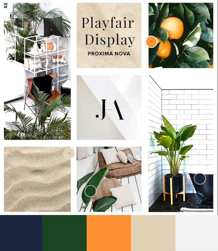
Now apply this similar exercise to your brand mood board. Write down the most prominent colours that are found across your mood board. Also take note of the tone of the colours. I.e., Are they soft, pastel colours, or bright and bold colours?
Try and narrow your list down to five different colours.
To help you out, below are some common colour associations:
Yellow: happy, bright, energetic, safe
Green: fresh and growth
Blue: loyal and trustworthy
Purple: luxury and royal
Red: power and action
Black: authority and power
TIP: If you're struggling to identify colours in your mood board, another good option is to upload your mood board to Adobe's Colour Wheel. Adobe will automatically select a colour scheme for you based on the photo.
2. Explore different colour harmonies
Colour harmony is the theory of combining colours in a fashion that is harmonious to the eye. To help you in choosing the right colour harmony for your brand, we've provided a brief explanation of each colour harmony along with some tips below:
Analogous: Colours that are next to each other on the colour wheel. Example: green and blue.
Tip: because analogues colours are often found in nature, they are pleasing to the eye and good to use in large doses, however, make sure you have enough contrast in your colour scheme as well.

Monochromatic: Incorporating many tints and shades of a single colour.
Tip: to avoid your colour palette from looking washed out, make sure you include a variety of dark and light tones to create a contrast.

Triad: Colours that are evenly spaced around the colour wheel.
Tip: Triadic colour harmonies tend to be quite vibrant so ensure the colours are carefully balanced (E.g., one dominant colour, two accent colours).

Complementary: Colours that are opposite each other on the colour wheel. Example: red and green.
Tip: if using complementary colours, don't use them in large doses. Keep them for when you want something to stand out (i.e., Buttons).

Compound: A variation of the complementary colour scheme. In addition to the base colour, it uses the two colours adjacent to its complement.
Tip: this colour harmony is probably the easiest to use and therefore, best for beginners.

Refine your 5 chosen colours by having a play around with different colour harmonies using Adobe's Colour Wheel.
3. Add contrasting tones
Regardless of which colour harmony you are using, a good colour palette should always include a mix of light and dark contrasting tones. Review your 5 chosen colours and make sure you have incorporated at least one dark and one light colour into the mix.
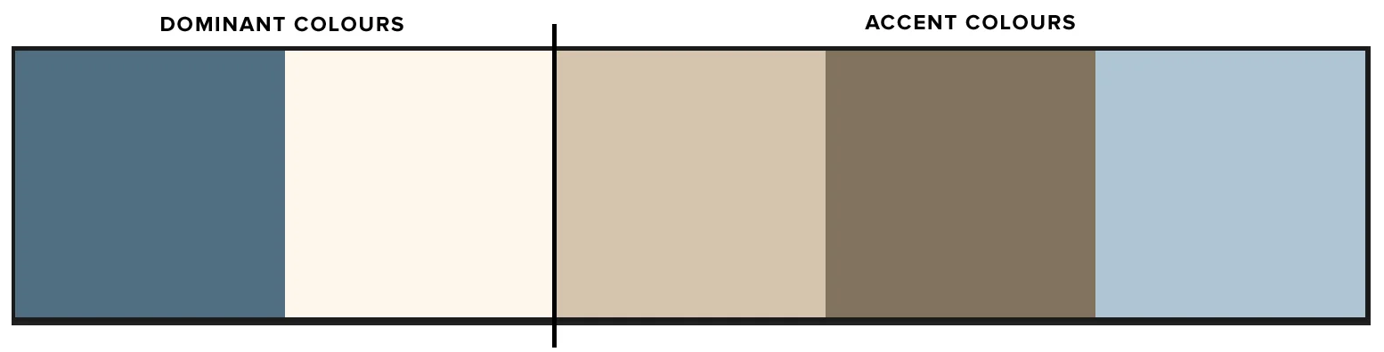
4. break your colour scheme into dominant and accent colours
Now that you have your chosen colour scheme, it's time to break it up into your dominant colours and your accent colours. Pick two colours out of the five that will be your dominant colours. These are the colours that will be used most often and across all material. These should be the most recognisable colours. The remaining three colours will form your accent colours that will be used sparingly.
Congratulations! If you've been following our branding series, you now have your brand mood board, logo and colour scheme. Only one step left, choosing your brand fonts.